Best cross platform app development framework in 2022 - From nothing to MVP in 12 weeks using Flutter

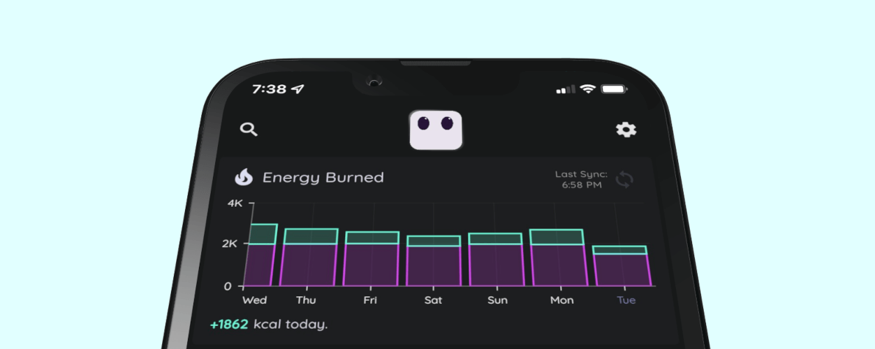
In the fall of 2021, we had the opportunity to bring our idea for Metriport to life using Flutter/Dart. If you haven’t heard of it already, Metriport is a privacy-focused personal wellness app available on iOS and Android that helps you quantify your life and gain actionable insights into your wellbeing.
When we started building Metriport, we knew nothing about Flutter. Despite this, we were able to design, develop, and launch the MVP for our product from scratch in about 12 weeks. We learned quite a bit along the way, and wanted to share our journey with anybody curious as to how we did it!
Here’s how we spent 12 weeks of time building Metriport using Flutter, with a team of 2:
Learning & Prototype: 3 weeks
Before writing a single line of code, we had to decide on how we’d bring our idea to life in a such a short period of time. We knew we wanted Metriport to be cross platform, and so we narrowed down our choice for an app development framework between React Native and Flutter. Having experience with JavaScript, React Native initially seemed like the obvious choice. However, we decided to hedge our bets on Flutter as it seemed like a more robust solution to our needs, even though we had to learn the framework from the ground up.
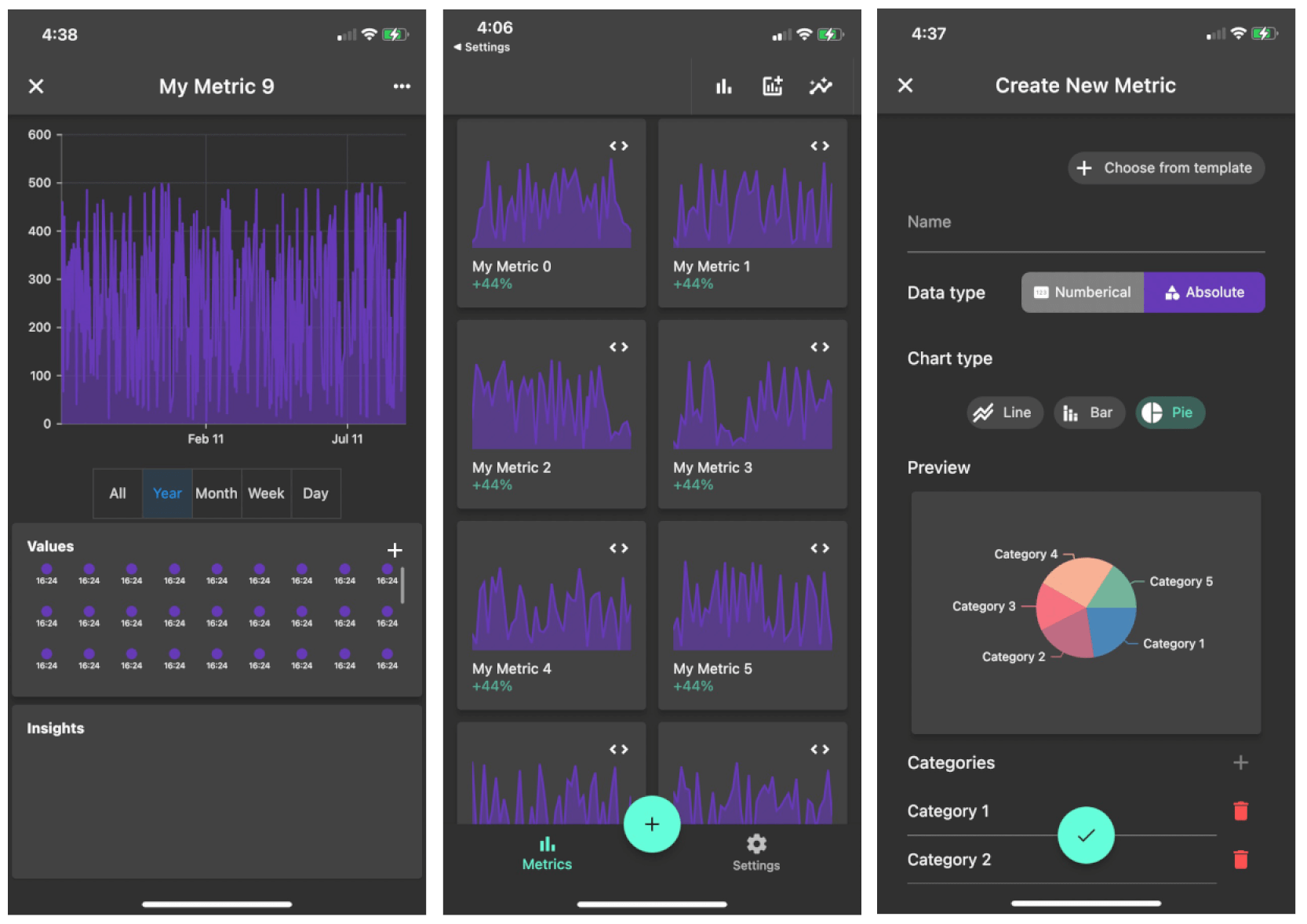
Initially, we tried to hack together a prototype of our app with extremely limited knowledge of Flutter fundamentals, and quickly found this to be a mistake (StreamBuilder, ChangeNotifierProvider, Context… what??). So, we decided to bite the bullet and take a Flutter/Dart course on Udemy, which turned out to be a great time investment. After spending around a week blasting through the course, we were equipped with the fundamental knowledge needed to bring our prototype to life. Although the prototype was basic, you can see it laid the groundwork for what Metriport would eventually become:

Pro-tip: the most confusing part of learning Flutter was the different options for implementing routing/navigation. TLDR; if you want the navigation to work well on both mobile AND web, you’ll need to use the new Router API. Understanding the new API takes a bit of time to absorb all the new concepts. We found going over this navigation example provided by the Flutter team on GitHub a great way to solidify the concepts and best practices.
MVP Wireframes: 1 week
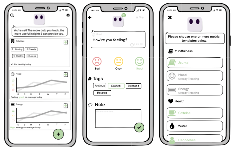
Once we had a prototype in our hands, we set out to get feedback from friends and iterate on our design in order to map out a plan for our MVP. We stepped away from development for a week, decided on what features would be included in the scope of work, and designed wireframes for every single screen using Basamiq Cloud. Getting feedback from others was essential in this process, as we ended up scrapping/modifying certain features after gaining insight as to what made the most sense from a UX perspective. When it was all said and done, we were left with a few dozen Wireframes that we used as a roadmap for the development weeks ahead. We were now ready to build our MVP!

Development Sprint: 8 weeks
To manage our work, we broke down the wireframes into individual tasks on our self-hosted Gitea, and planned out the workload in rolling one week sprints. The key here was to make sure we were both working on segregated tasks, so that we wouldn’t get into a merge conflict hell. Our workflow was extremely basic:
- One master branch.
- For each new piece of code to be merged, create a feature branch and a corresponding pull request.
- Review each-other’s pull requests, and merge straight to master if it looked good.
- Create tags off master so we could easily revert to important milestones.
- No automations, pipelines, or etc.
Right off the bat, we feel in love with the robust Dart DevTools that came baked into Flutter. Debugging code was a breeze with robust and verbose exception handling, and the performance profiling tools helped us achieve a snappy user experience despite the fact our app has to process thousands of data points. Additionally, Flutter’s widget inspector was also very handy for our development process, as it allowed us to visualize and dissect widget trees. This made it easy to understand app layouts and diagnose any confusing layout-related issues.
Widgets are the building blocks for UI in Flutter, and by default it comes equipped with an impressive and massive widget library. We’d recommend having a browse through the widget catalog, as whatever UI elements you need in your app probably already exist. The widget-tree system makes Flutter so simple to use and quick to get your ideas out into the real world. Here’s what code looks like for a styled button in the Settings screen of Metriport:
1
2
3
4
5
6
7
8
9
10
11
12
13
14
15
16

Card(
    shape: RoundedRectangleBorder(
        borderRadius: BorderRadius.circular(20)),
    child: ListTile(
            title: const Text(
            'Units',
            style: TextStyle(
                fontSize: 17,
            ),
        ),
        leading: Icon(Icons.square_foot,
            color: Theme.of(context).colorScheme.primary),
        onTap: () => _unitSelect(context),
        trailing: Icon(Icons.chevron_right,
            color: Theme.of(context).colorScheme.primary)),
),
After some Flutter compilation magic, it will look like this on the screen:

If there isn’t an existing Flutter widget for what you need, you can just browse through a massive library of third party packages at pub.dev. Since we were making a personal analytics app with a focus on our ‘personal data dashboard’ concept, we needed a strong charting library to use. Thankfully, there were many options to choose from, and we ended up going with Syncfusion Flutter Charts as it had exactly what we needed. Adding Syncfusion and any other packages to our app was as simple as running flutter pub add <library>.
Having experience with React Native, we absolutely loved that Flutter made styling hassle-free. We didn’t need to waste endless amounts of time writing manual styling in Metriport, with separate stylesheets to maintain. Instead, we styled as we went. This was as simple as adding the appropriate widget, then adding padding or coloring to that widget with a single click or line of code. As a bonus, all widgets are 100% responsive, which resulted in a beautiful UI on any screen size right off the bat.
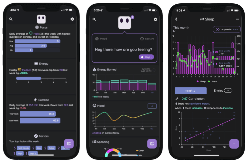
The final product ended up exceeding our expectations. We surprised ourselves with what was possible in to build in only 8 weeks of development time with Flutter - a feature-rich product that we would use in our daily lives.

Launch & Lessons Learned
Deploying a build to the iOS App Store and Google Play Store was so easy with Flutter, thanks to excellent documentation provided by the development team. Simply follow the guides for iOS and for Android respectively. After launch, Flutter was flawless in delivering a consistent user experience across both iOS and Android platforms.
That being said, one of the biggest lessons we learned after launching Metriport was to make sure to test on the latest Android OS (12 in our case), on an actual device. Despite using Android emulators for testing, there were still a few bugs that came up only from Android users with very new devices that we had to fix immediately after launch. This was outside of Flutter though, and was mostly related to OS-internal changes we had to compensate for in our code.
One of the most consistent pieces of praise we get for our app is the gorgeous UI/UX. We put quite a bit of work into the styling and design, however Flutter definitely made this process quick and easy for us.

Concluding Thoughts
Having one codebase that can be compiled to desktop, web, and mobile makes Flutter pretty hard to beat. Although we currently only have Metriport on iOS and Android platforms, we definitely plan on expanding to additional platforms in the future. It’s comforting knowing we can pretty much do this whenever we want, from the existing codebase.
The speed it takes to go from no knowledge of Flutter to having a complete app is remarkable. There were only two of us building Metriport at the time, and we were able to get a lot done in a short period of time.
Whether it’s Flutter’s powerful debugging and analysis tools, extensive built-in widget library, massive pub.dev community for third party libraries, quick and painless styling parameters, or gorgeous and responsive UI, it’s obvious to us that Flutter has the upper hand for as the best cross platform app development framework in 2022.
Flutter was indispensable for building Metriport. Feel free to check out our app on iOS or Android to try it for yourself. We hope you don’t hesitate to give Flutter a try on your next project, and have the same enjoyable experience we did!